A name with a story
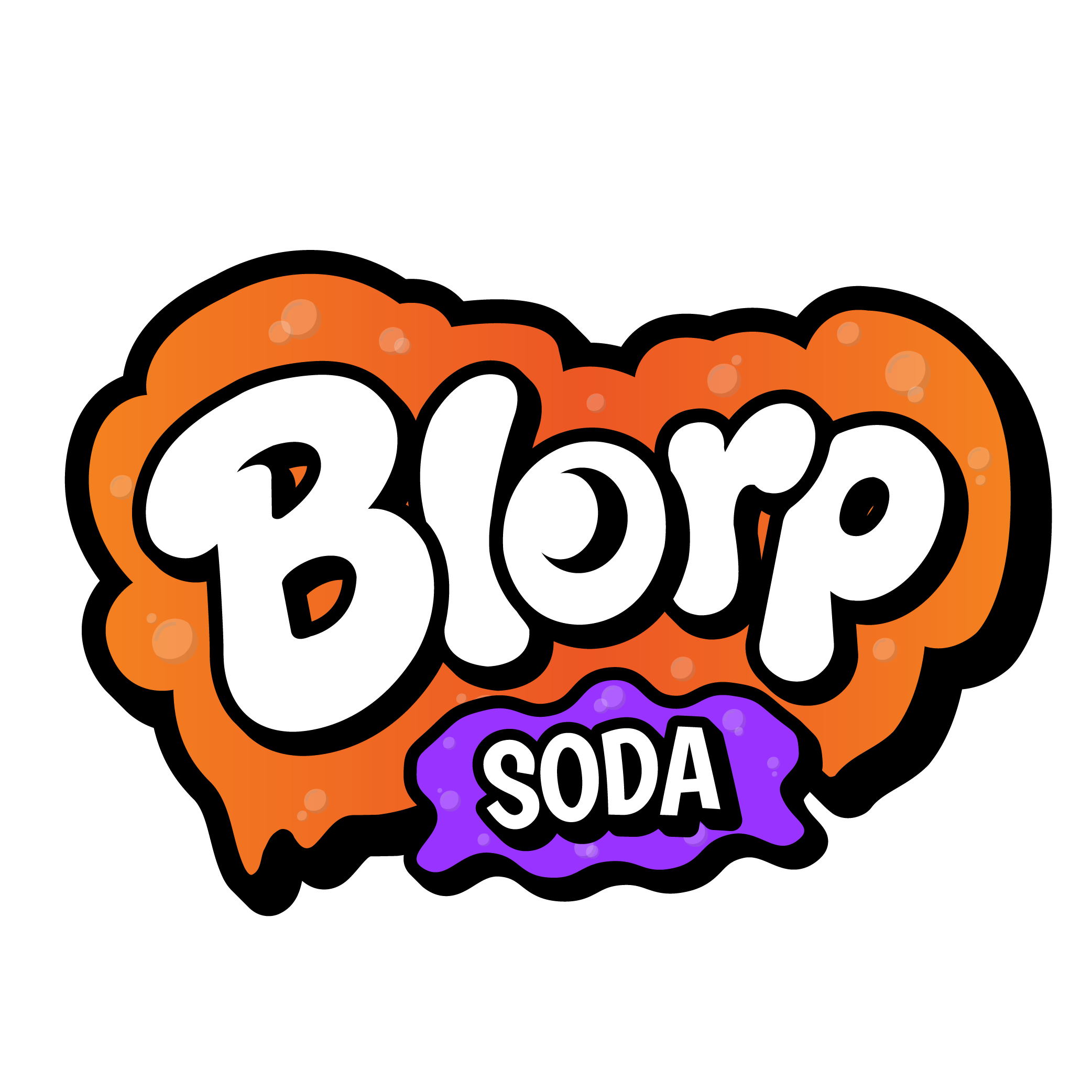
“Blorp” is what an alien calls soda: strange enough to stop you, simple enough to remember, and flexible enough to carry an entire world.
 Lion + Lamb CreativePay an invoice
Case study 01 · Blorp Soda Co.
We turned a playful product idea into a complete character-driven world—built to earn attention on shelf and keep unfolding after the can is opened.
Enter the universe ↓
The assignment
Blorp began with a clear opening in the beverage aisle: modern soda alternatives often looked clinical, restrained, and ingredient-first. This brand needed to lead with joy while offering a low-sugar, caffeine-free soda for people who wanted a more thoughtful treat.
The answer was not a quieter can. It was a louder imagination—a distinctive identity, three flagship flavors, and an original cast of characters designed to make the brand feel bigger than the beverage.
The strategic idea
Instead of competing through wellness language alone, Blorp would own an emotional position: nostalgia, exploration, and play. The product could satisfy an adult filter—lower sugar, no caffeine—without giving up the color, flavor, and delight people expect from soda.
“Blorp” is what an alien calls soda: strange enough to stop you, simple enough to remember, and flexible enough to carry an entire world.
Thick outlines, vivid flavor colors, tactile illustration, and a family of expressive cans made the system feel collectible without losing clarity.
Original characters and stories gave the brand room to grow into content, merchandise, community experiences, and playful digital extensions.
The identity
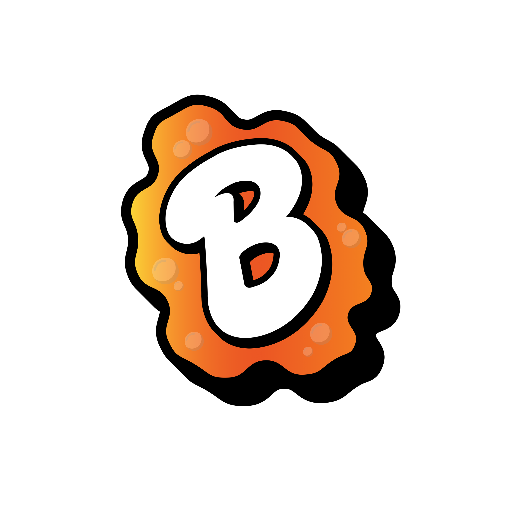
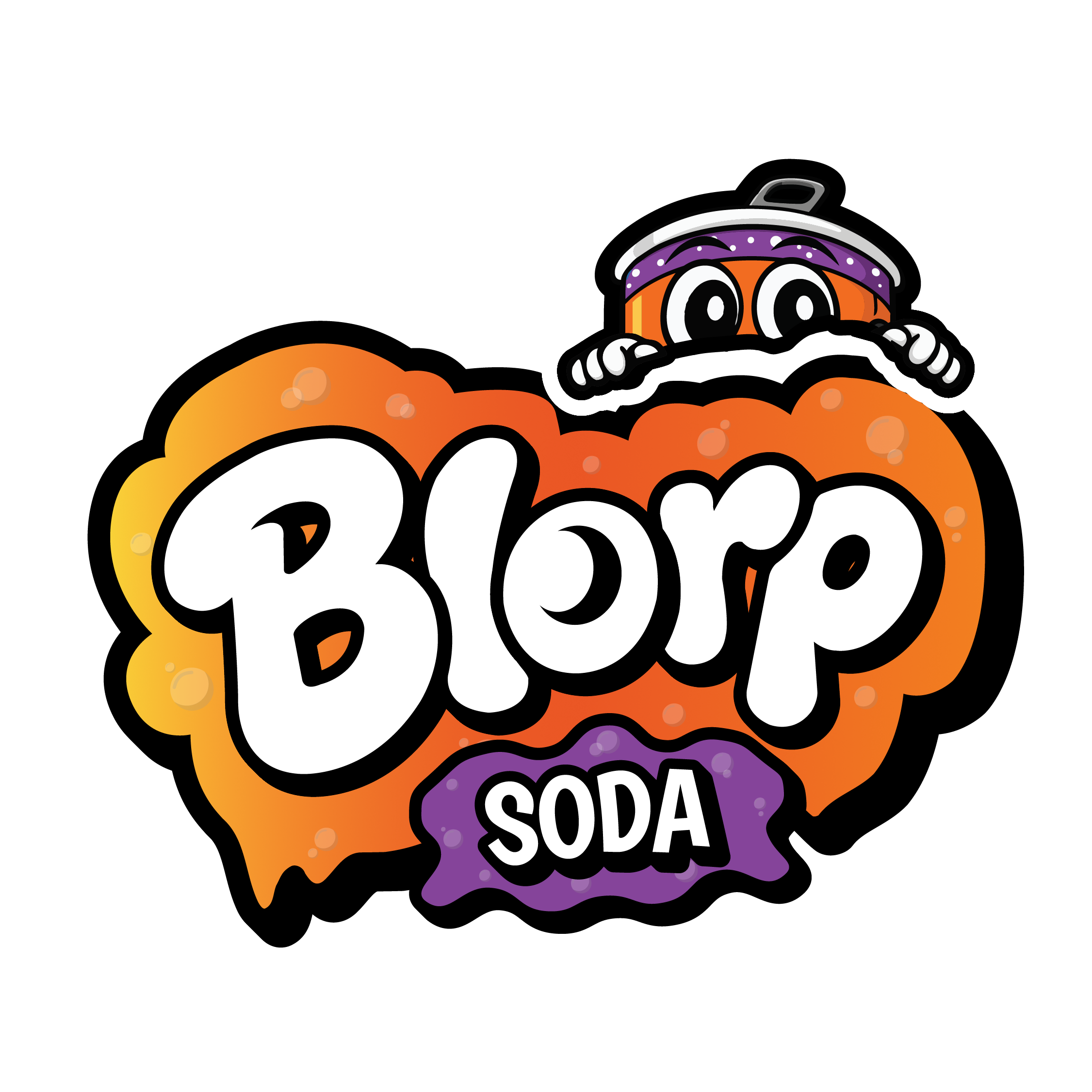
A bubbly wordmark, molten shapes, heavy outlines, and expressive character illustration made the identity feel hand-built and alive. Every mark was designed to hold its own—from a can to a cap to a tiny icon.
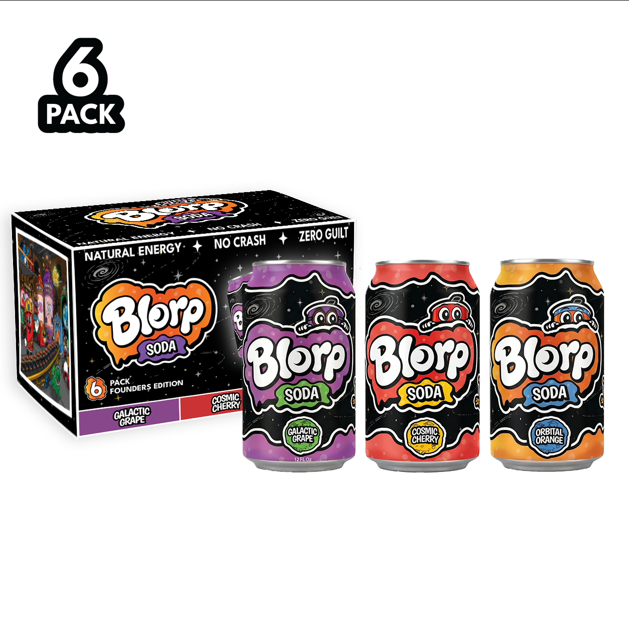
The packaging system
The black, star-filled base makes the family unmistakable. Flavor-led color bands, bold badges, and individual character moments make each can easy to navigate while rewarding a closer look.
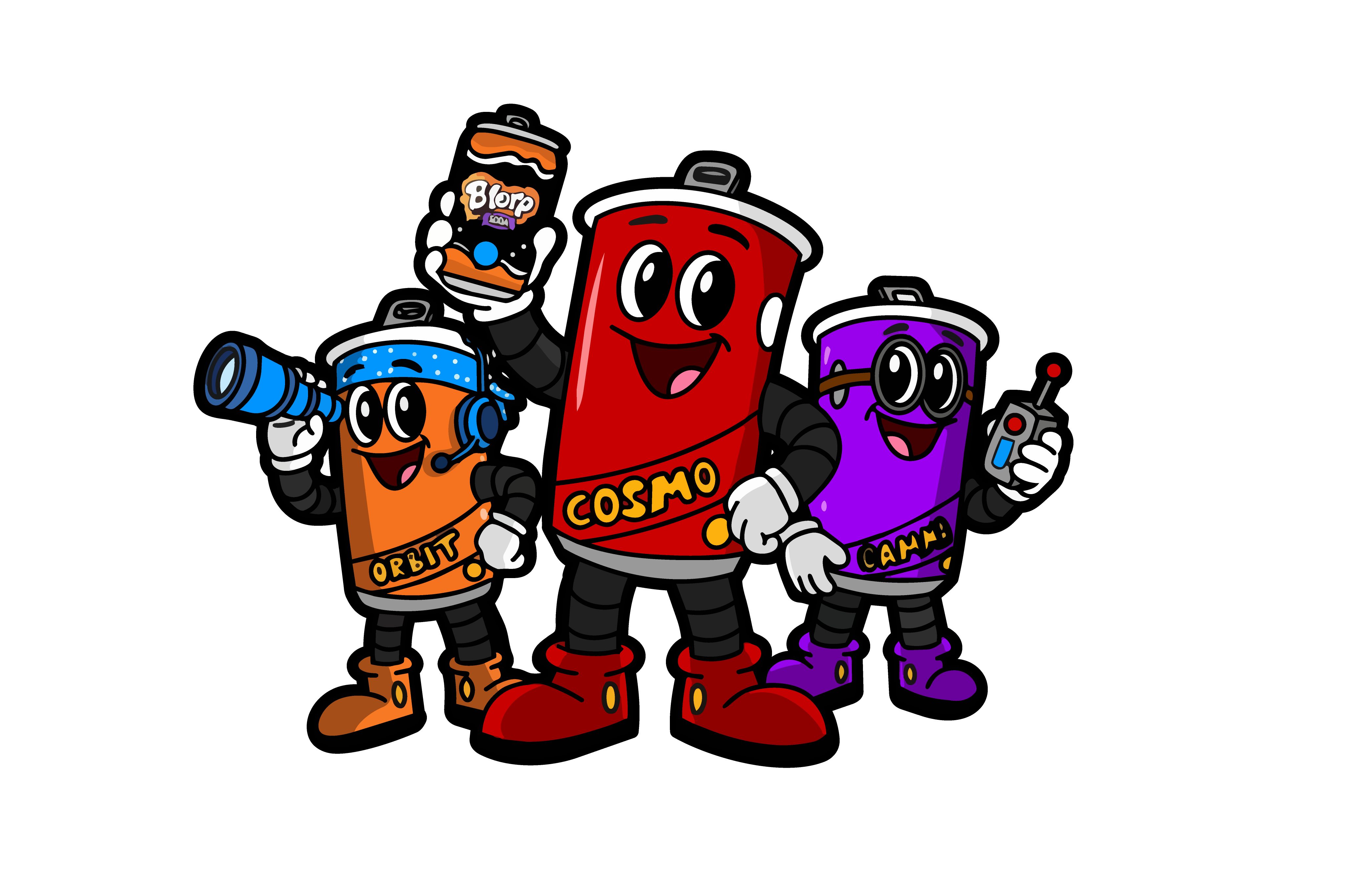
Cosmo · The fearless center of the crew.
Gamma · Curious, clever, and ready to explore.
Orbit · The inventor whose gadgets almost work.
The character universe
Cosmo, Orbit, and Gamma give each flavor a personality and give the brand a narrative engine. The visual language was designed to move naturally into stickers, merchandise, social content, and future QR-powered browser adventures—without losing the warmth of the hand-drawn world.
Built to leave the screen
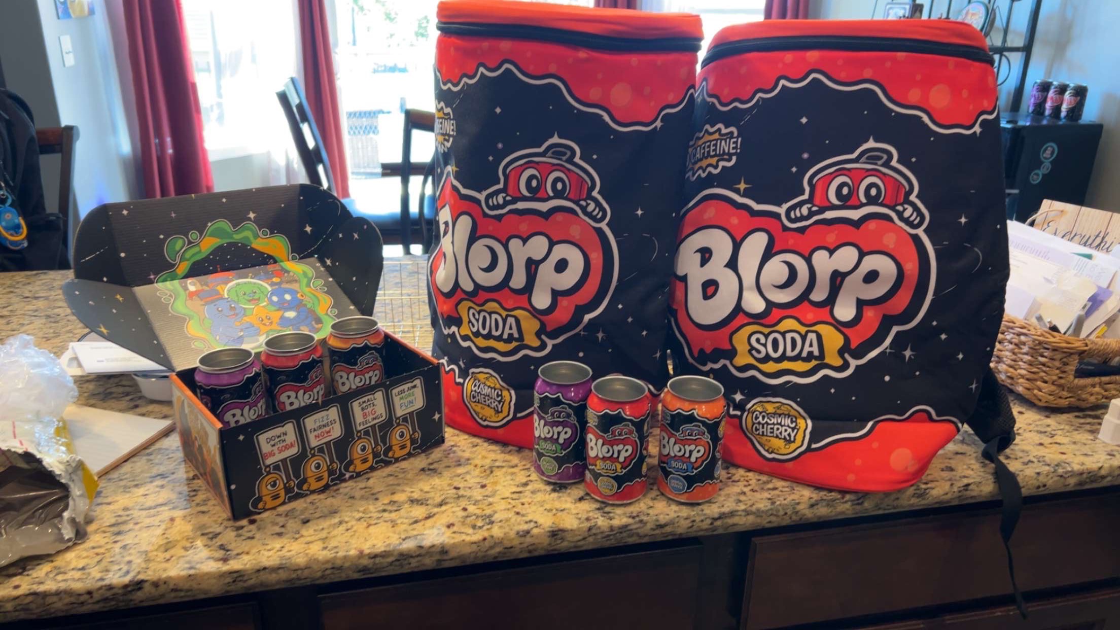
The identity was carried into cans, multipacks, sampling displays, coolers, and portable brand moments for a direct-to-consumer pilot. That gave Blorp a practical way to test demand, flavor preference, messaging, and audience response before scaling into retail.
The outcome
Blorp emerged as a cohesive, pilot-ready brand with the shelf presence of a beverage company and the imagination of an entertainment property. Every piece points back to one memorable promise: fuel your imagination.